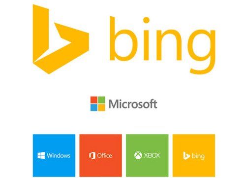
Days after Google’s upcoming new logo leaked, Microsoft’s Bing search engine is getting a new look at. Looks like everyone is getting flat as Bing is also dropping its curly blue logo for a modern flat design that closely matches the rest of Microsoft’s product branding. The color is actually the same one used in a quadrant of Microsoft’s corporate flag logo. Bing’s angulated and modern logo comes just after Yahoo revealed its own redesigned logo. Microsoft has opted for a stylized lowercase ‘b’ that’s sharp and aligns neatly with the Segoe font for the wordmark.
Bing has also been overhauled and rewritten from the ground up to support a new responsive design that adapts across PC, tablet, and phone. The result, available in preview here, aggregates some existing features that were buried away in the old design, and some new features that help surface information a lot better.

