

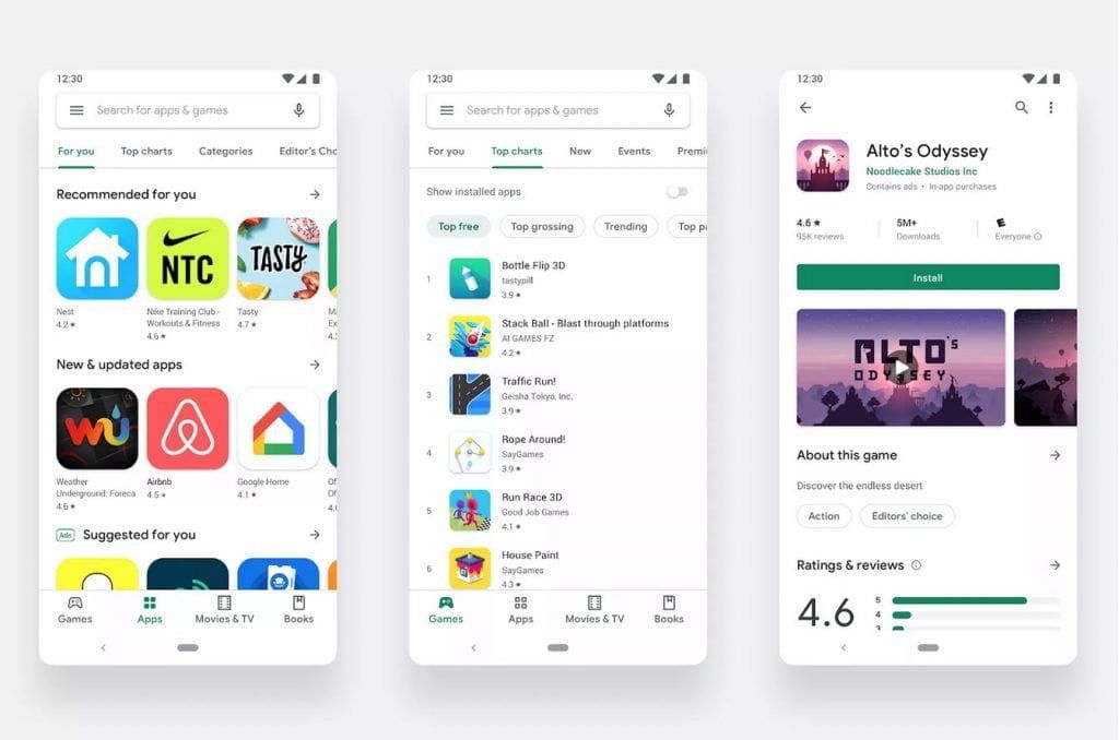
Finally, the Google Play Store is getting a fresh redesign, which does away with the colorful green header in favor of a brighter and whiter style. This also happened to the Gmail app in its last redesign when it lost it’s red header as part of the same Material Design revamp.
The iOS App Store got a similar redesign two years ago — the new Play Store now has separate tabs for apps, games, books, and another for movies and TV shows.
The tab bar will appear on the bottom for phones and in a sidebar on tablets and Chrome OS devices. Google will also only show icons in the Google Play Store with rounded rectangles, just like iOS, which gives the whole storefront a more cohesive and consistent look.
Say ? to fresh updates on the Play Store. See what’s changed: https://t.co/QNAcoScN3o pic.twitter.com/0DlEZ1TBN0
— Google Play (@GooglePlay) August 21, 2019
The new Google Play Store will recommend apps specifically for the user under a “Recommended for you” section and you should not confuse this with the paid advertisement recommendations that it’ll also offer under the similar-sounding “Suggested for you” label.
Wondering when you will get it? According to Google, and confirmed by various Reddit users, the new Play Store should be rolling out now. What is curious for now, it doesn’t seem like there’s a dark mode for the bright new design, so you might want to bring a pair of shades just in case. We think the dark mode will be shown off with the upcoming Pixel 4.