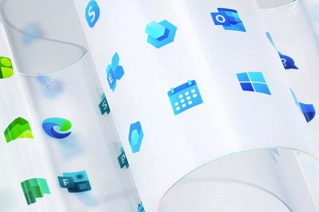
Microsoft’s new Windows logos, icon work and Fluent Design has been a gradual process, and this will continue throughout 2020. The company’s Edge browser now has a new icon, and even Office itself has a more modern logo. There’s still much to be done, and Microsoft is even trying to tackle mobile design.
Microsoft is changing its Windows logo and the icons for many of the operating system’s apps. For over a year, the software maker has been planning an icon overhaul, and the company’s new Office icons were only the start. Microsoft is now redesigning more than 100 icons across the company with new colors, materials, and finishes.
This is all part of a bigger strategy to modernize Microsoft’s software and services under the Fluent Design set of principles. Jon Friedman, corporate vice president of design and research at Microsoft explained that.
“With the newest wave of icon redesigns, we faced two major creative challenges,”“We needed to signal innovation and change while maintaining familiarity for customers. We also had to develop a flexible and open design system to span a range of contexts while still being true to Microsoft.”

Most of the Windows logos and icon changes aren’t major overhauls, but subtle tweaks that make them look far more consistent when you look at tens of them together at once. Microsoft appears to be focusing part of its design efforts on cleaning up its Windows icon problem. Windows 10 has lots of inconsistent icons appearing in settings and apps, with some old icons dating back decades.
Windows 10X appears to be part of the answer to this problem. The software maker revealed a slightly tweaked Windows logo as part of its Windows 10X announcement earlier this year. Windows 10X is designed for dual-screen devices, and it even has a new Start menu and no more Live Tiles.
Microsoft Windows logo and icon designers are now working collaboratively internally in what’s described as an “open source” way.


