MORE

    Bing logo gets a redesign

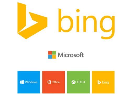
    Days after Google’s upcoming new logo leaked, Microsoft’s Bing search engine is getting a new look at. Looks like everyone is getting flat as  Bing is also dropping its curly blue logo for a modern flat design that closely matches the rest of Microsoft’s product branding. The color is actually the same one used in a quadrant of Microsoft’s corporate flag logo. Bing’s angulated and modern logo comes just after Yahoo revealed its own redesigned logo. Microsoft has opted for a stylized lowercase ‘b’ that’s sharp and aligns neatly with the Segoe font for the wordmark.

    - Advertisement -

    Bing has also been overhauled and rewritten from the ground up to support a new responsive design that adapts across PC, tablet, and phone. The result, available in preview here, aggregates some existing features that were buried away in the old design, and some new features that help surface information a lot better.

    - Advertisement -

    IN THIS STORY STREAM

    Techjaja Staff
    Techjaja Staff
    A Techjaja 'bot' Profile

    Fresh Tech

    Mobile Tech and the Evolution of Sports Betting in Uganda

    The landscape of entertainment in East Africa has shifted...

    The Matchday Experience: How Tech Keeps Live Sports Betting Smooth Under Pressure

    Matchday puts everything to the test. On matchday, people...

    Starlink Suddenly Stops Working in Uganda: What Happened and Why It Matters

    For the few who have been using Starlink in...

    The Linebet mobile application for Somalia: betting anytime, anywhere

    The Linebet mobile app is made for people who...

    Airtel Teams Up with SpaceX’s Starlink to Bring Phone Signal to Remote Areas

    Imagine you're hiking in a remote part of Africa,...
    - Advertisment -

    Discover more from Techjaja

    Subscribe now to keep reading and get access to the full archive.

    Continue reading