

A long time ago, Android design was never a priority, it was drowned in shadows and Holo Blue highlights. Then Google I/O 2014 came along and dragged Android screaming into the light with Material Design, a white canvas covered with colorful title bars, hamburger menus, and floating action buttons. As years passed, the Android team has continued to refine and further hone the Material Design UI that it used across Android — and beyond on Chromebooks, Google’s web services, and iOS apps — but it was a very slow, calculated process.
In other words, Android design stagnated.
With the advent of Android 12, Google has unveiled at Google I/O 2021, another huge update for Android’s look and feel, precipitated by months of close collaboration with the Android and Material Design teams. Material You is the next generation of Material Design.
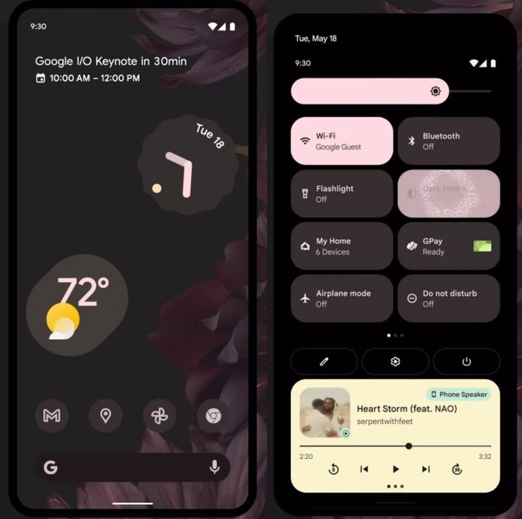
Material You can automatically re-color its accents and elements based on the colors in your wallpaper as shown above. Some of that looks Pixel-exclusive — but first, let’s focus on the other visual changes that accompany the newfound vibrance: the biggest change visually is to Quick Settings. Quick Settings are swapping from round toggles with a text label underneath to rectangular toggles with the text label inside.
The result is that you’ll have fewer toggles on a single page, but the quick toggles pop more when on or off, and users who aren’t as intimately familiar with what each icon means can read what a toggle is in and what state it’s in. It’s a tradeoff that advanced users probably won’t enjoy, but newer Android converts will.
The brightness and volume sliders are fatter, matching the thicker Quick Settings tiles. Fonts across the board are thicker, too, helping make them easier to read when you’re dealing with a dark green font on a light green background, for example, or white text on a very busy wallpaper.
Android 12 as a whole plays with thickness and thinness, just as it plays with color, bringing a sense of fun and whimsy to a system that in recent years had felt boring and flat.
Lock Screen design

The lock screen features that ridiculously oversized clock, but being matched to the wallpaper colors, that clock never looks out of place. It’s got a wonderful balance, even if it isn’t quite as practical when we all have a billion notifications constantly barraging our phones.
The home screen possibilities for Android 12 are so vast, but what was even more eye-catching from this smorgasbord of examples from Google was that no matter the wallpaper, no matter the color scheme, each home screen looks cohesive, from the vastly diverse but always color-coordinated widgets to the perfectly uniform, softly-tinted icons — which are reminiscent of Smart Launcher 5’s Icon Pack Studio. The Pixel-exclusive At a Glance widget doesn’t get a colored background, but it is shifting from centered to left-adjusted, so it looks the same on the home screen and the updated lock screen.
New Widgets
The rest of the improved Android 12 widgets aren’t limited to a single shape, like iOS 14 instead, Google has come back and brought color-matched widgets in oblongs, clovers, and some adorable, squiggled clock widget that looks like it came out of a spirograph. It’s more colorful, playful, and it better reflects Google’s personality.
The new home screens — and the possibilities they offer, are incredibly exciting, especially for the themers and launcher developers who are always pushing the envelope of Android to make something new, fresh, and fun.
The palette itself helps tie everything together, and it’s time to dive deep into the colorful new world of Material You.