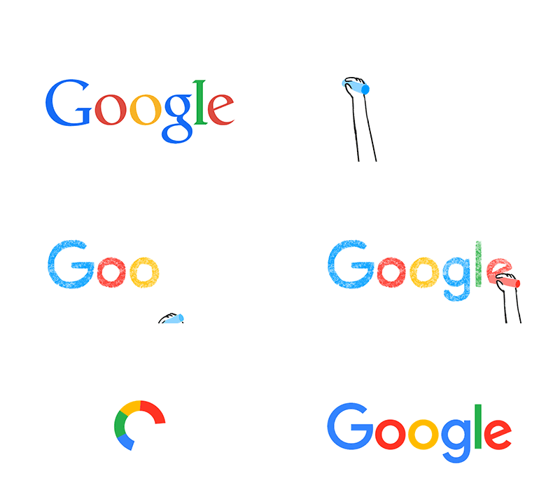
For over 17 years, Google has been continuously changing with the vast range of products and projects under their wing to the whole new Alphabet in which google now falls under. Earlier today, someone asked what I feel about the new visual changes, my thoughts are simple, Google’s new logo is minimalist and to an extent that feeling you get when something funny or annoying just happened — hence the spazzy sheepy noise (Mehh).Whereas Google gives some cosmetic reasons why it had to change its logo. Personally, I would care less if they changed it or not.
Let’s get down to what Google did. This new logo is still a wordmark, right? Yes I am. Now Google has also adopted a sans-serif typeface, making it look a lot more modern to suit its latest design language that we have already seen in the latest versions of stock Android. Unlike the previous color palette, the new one is softer and has more resemblance to the logo of Google’s new parent company, Alphabet.
Since 1999, when Google first made a change in the lettering and settled on its four colors, the logo has just been flattened out more and more (material design anyone?), with yesterday’s update representing a significantly huge leap. They did not stop there, in addition to changing up the wordmark, Google also changed the tiny “g” logo that you see on browser tabs. It’s now going to be an uppercase “G”.

Why did Google decide to make the change?
- Advertisement -

