
ANDROID ONE
Google started off the keynote with some good news with us here in Africa and Asia and other emerging markets. Its Android One. It’s a set of hardware reference platforms for OEMS. The Android One uses stock Android, but through Google Play OEMs and carriers can add their own apps. The platforms are “high quality, low-cost” smartphones with widely available parts.

Those Play apps auto-install, as do updates from Google itself. One example is the India smartphone maker Micromax. They have made a reference Android One device with a dual-SIM phone, a 4.5-inch screen and an FM radio. It costs less than $100. Android One is starting in India in the fall. Micromax, Karbon, and Spice.
All the news that you might have missed at day one of Google
THE” L” WORD
The next big release of Android is called L (we think it’s still a code name as they cook up the best dessert for it when its officially Launched). The goal of L is providing “at scale, high-quality, affordable smartphones” for “the next billion.” According to VP of design Matias Duarte who showed off “L Developer Preview” said
“We wanted to rethink the user design experience in Android.We challenged ourselves to create a design that was not just for Android phones and tablets. one consistent vision for mobile, desktop, and web. What if pixels didn’t have color, but depth?”

IN COMES MATERIALS
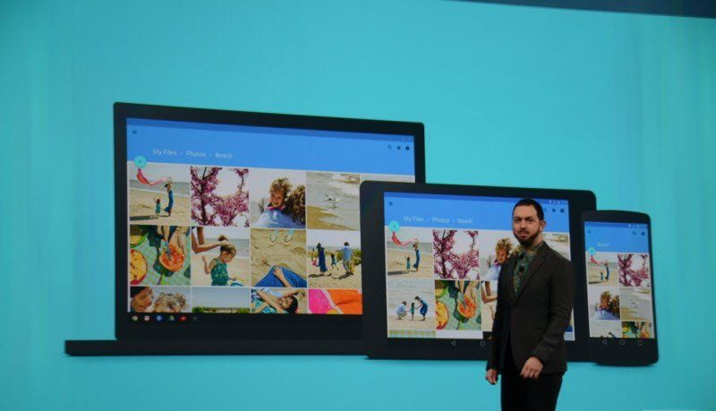
The new design language of Android is called “Material Design.” It’s colorful and simple. It’s not as dark and foreboding as Holo, but not as transluscent as iOS. The transitions seem quick and helpful, but not overbearing. Google drew inspiration from paper and ink. There are shadows throughout the user interface (UI) too. Developers can specify an “elevation value” for anything in the UI. Then Android gives it the correct perspective and proper shadows. There’s a mix of straight, boxed lines, round buttons, and bright colors. A new feature is called “pallete,” which lets developers automatically figure out the colors in images and match their UI. The Roboto font has been updated to work on every screen “from your watch to your laptop to your television.”
Material surfaces respond to physics like card stock.”Developers will be able to animate how stuff can move between screens. The the UI also more bold colors. The buttons get bigger and start floating above the list. It animates at 60FPS. On the web.
That’s impressive and uses Polymer, which lets you do all of this design on the web, or in web apps. It’s all going to be at google.com/design.